Making of Divine Awakening
It all started
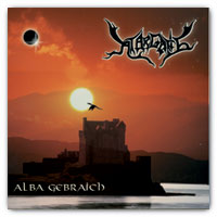 about five years ago. Back
then I voluteered to design the CD Cover
for ATARGATIS' debut MCD 'Alba Gebraich'. I did that for free, as I
was out of the business of creating cd-covers for a
living for some time by then, and because my connections to
some of ATARGATIS' members predated even that time.
about five years ago. Back
then I voluteered to design the CD Cover
for ATARGATIS' debut MCD 'Alba Gebraich'. I did that for free, as I
was out of the business of creating cd-covers for a
living for some time by then, and because my connections to
some of ATARGATIS' members predated even that time.
The 'Alba Gebraich' artwork and booklet was a fun project, taking up
about 3 days all things told. One of which was spent with the band
sitting behind me while I was going wild in Photoshop. All artwork was
created on that day, only for the text-layout for the booklet etc. did
I work on my own.
So when they asked if I might do another CD for them I was
more than delighted. After some rather wild ideas for the cover - it
would almost have been a SciFi style one - they settled for something
with a dark forest, a small lake and maybe a slim figure sitting at the
lakeshore...
A first quick draft
 was based on an image I found on the Net
which I thought would be ideal for the forest/water theme...
was based on an image I found on the Net
which I thought would be ideal for the forest/water theme...
 So
I set out to creat a first rough draft of how the final cover might
look like. The image you see here was the product of maybe one hour of
fiddling in Photoshop
So
I set out to creat a first rough draft of how the final cover might
look like. The image you see here was the product of maybe one hour of
fiddling in Photoshop
The band was more than delighted, and I had a real problem on my
hands. As nice and fitting the image might be, I was not sure if using
this image might get me into legal difficulties... I had never planned
on using this exact image anyways. It is such a strong motive in itself
that it would always be instantly recognizeable, regardless how much O
could try to alter it.
But like always if a first draft 'hits the mark', it becomes difficult
changing it too far.
So I stared down a thorny path
of long and sleepless nights trying to recreate the power of
this first draft with something fully my creation...
 A
inital concept created with Poser & Bryce
took me almost two nights to complete - and failed miserably to inspire
the band. The mood was all wrong - which could have been changed - and
also the definite CGI touch went down quite the wrong way.
A
inital concept created with Poser & Bryce
took me almost two nights to complete - and failed miserably to inspire
the band. The mood was all wrong - which could have been changed - and
also the definite CGI touch went down quite the wrong way.
Although I still think it is a nice Bryce render, I had to agree
with the band that it wouldn't work.
I gave up after a few further tries I will not be showing the world,
and let it rest.
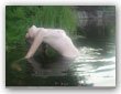
On a nice Saturday
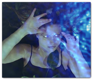 the
band came to visit so we could do all the other (interior) booklet
artwork together. We had decided to use a 'underwater' theme for all
the band-member portraits, and that went far smoother than we had all
expected. Combining a simple photgraph of the member lying on a grassy
floor with a really simply Bryce render gave us eerie portraits. (the
trick was to use an ímage pane under a water pane, and later
some photoshoping around the eyes)
the
band came to visit so we could do all the other (interior) booklet
artwork together. We had decided to use a 'underwater' theme for all
the band-member portraits, and that went far smoother than we had all
expected. Combining a simple photgraph of the member lying on a grassy
floor with a really simply Bryce render gave us eerie portraits. (the
trick was to use an ímage pane under a water pane, and later
some photoshoping around the eyes)
After each of the five had their special portrait and we had also done
a special group photo the day was done, ATARGATIS went home exited, and
I was left with glorious internal artwork but without a fitting cover
to live up to the quality standard we had just put forth...
Try a little harder
 was
what I thought to myself and set out to do the ultimate cover for this
project. But as it is often when we try really hard... We waste a lot
of time without really achieving anything worthwhile...
was
what I thought to myself and set out to do the ultimate cover for this
project. But as it is often when we try really hard... We waste a lot
of time without really achieving anything worthwhile...
Going for the photorealistic but still completly generated dark
forest I went and wasted another really long night creating a buch of
trees in Bryce. Always trying really hard for a natural look, tweaking
each and every tree untill it looked just right.
With no little trpidation I put the result into an email to my friends
and went to bed early (5:00 am)
But somehow I already knew what the result would be. The design
flopped, totally. To arteficial, wrong color, they didn't like it one
bit.
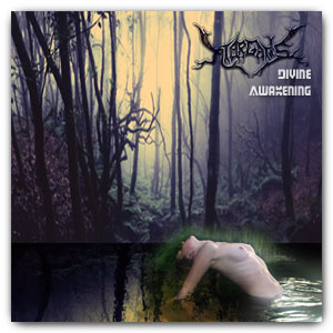
Back to the roots
I told myself after I had recovered from my disapointment. Being
totally honest I had to admit this draft might the best one since the
first, but it simply didn't have the power of that first one.
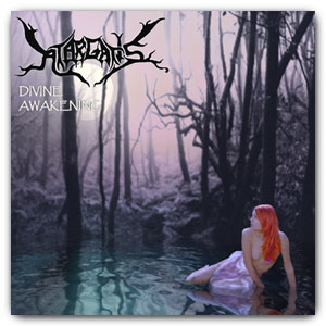
 But
I wanted to go even beyond the simple raw pwer of the first draft - as
a draft it was and had some flaws that would simply not look good being
printed. So I tool that concept as a starting point and recreated it
piece by piece, this time using all the Bryce and Photoshop tricks in
my basket.
But
I wanted to go even beyond the simple raw pwer of the first draft - as
a draft it was and had some flaws that would simply not look good being
printed. So I tool that concept as a starting point and recreated it
piece by piece, this time using all the Bryce and Photoshop tricks in
my basket.
A quick render was done using the original forest picture from the
beginning as a backdrop, but this time partially transparent so that
the sun/sky would shine through. The basic Bryce scene being so simple
I was able to spend far more time on getting the lighting/mood right.
At 2:00 am I was happy with what I had and sent the preview off to the
band to look at. I was pleasantly surpised by the enthusiastc reponse I
got! 'Absolutly what we wanted, Wow!'
All I need to do now was 'finalize' the draft... Hah. That was about
80% of the work still before me.
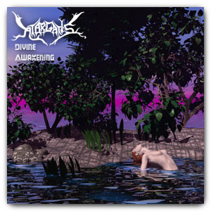
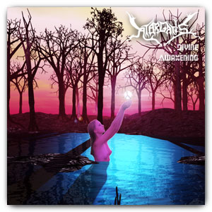
 Yet another solid 8 hours of
work
Yet another solid 8 hours of
work
lie between the final draft and the version you see to the right.
Most of that time was spent on cosmetics for the water goddess, subtle
facial changes, hair etc.
Some more time was spent tweaking the overall composition, type etc.
The final render at 1600x1600px took about 3 1/4 hours, although I
think that's due to some over zealous volumetric settings and haze that
doesn't really show and could be left out...
The ewnd result
is well worth my time I think. Sadly the size and xompression needed
to display it here on the web won't show you the real beuty of it. For
that I guess you will need to obtain a copy of the final printed
version, which I can only heartily recommend. (You'll need to be really
quick and resourcefull too. There will probably only be about 500
copies printed, and distribution will be concert sales and pronotional
mailings only...)